
Manage your layout
Advanced content manager has the ability to manage your layout from the administration panel. However, it doesn’t block the developer and let them the choice to use it or to define their own template for a content type.
Click here to read more about how to create your own template.
Step 1 - Select your layout
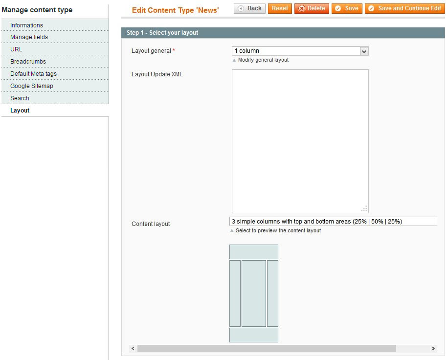
Layout general: Define which magento layout will be used for the whole page. Same as categories, pages, product pages. Default values on a new install are 1 column, 2 columns with left bar, 2 columns with right bar, 3 columns and empty.
Layout Update XML: XML update for your magento layout. Can be used to add or remove a block from your columns.
Content layout: Define the layout for the content itself. You may want several columns to order your fields on the page. The content is displayed on the main column of your site.
You can have a general layout set to 3 columns, and then set another 3 columns layout for your content. These last columns will be printed in the middle column of your site.
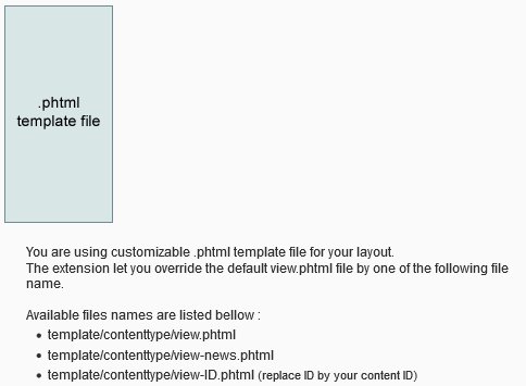
This value is set to “Custom” by default. This means that your content will use .phtml file for display purpose. A list of available .phtml name is printed so you can create a dedicated phtml for your content.
However, you can easily organised your fields in layout, group them, add css classes, add label. It is usually enough even for developers of very custom template.
If you need special developments and create your own .phtml file to handle your content display, click here to have complete information about how to create custom template.
Step 2 - Drag and drop items in your layout
If you choose to use non-custom layout. Two steps will be displayed to allow you dispatching your fields, or CMS blocks in your columns.
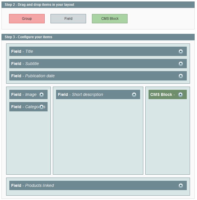
Step 3 - Configure your items
Layout item - Field
Add a field value to your layout.
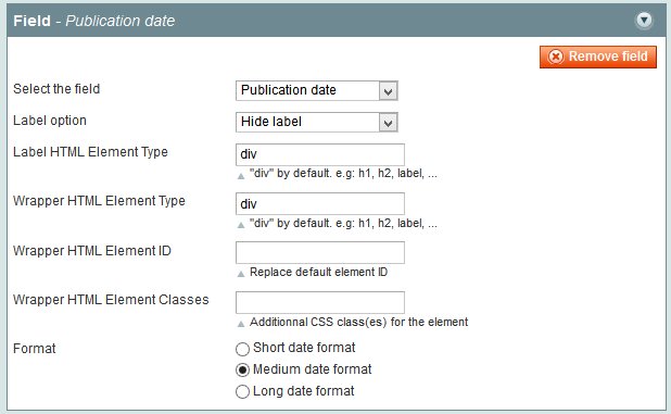
Select the field: List of all existing fields of your content. Only saved fields are listed, if you just added a new field, click on Save and continue edit button to have it listed here.
Label option: Ability to add the label of the field before, after or inline of his value.
Label HTML Element type: Define the label html tag.
Wrapper HTML Element type: Define the wrapper of your field value html tag.
Wrapper HTML Element ID: Add an ID attribute on your wrapper tag.
Wrapper HTML Element Classes: Add css classes attribute on your wrapper tag.
Format: Depending of your field type, this define the output format of the value.
Layout item - CMS Block
Feature to add a CMS Block directly in your content layout.
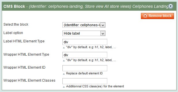
Select the block: List of all existing CMS blocks.
Label option: Ability to add the title of the block before, after or inline of his value.
Label HTML Element type: Define the label html tag.
Wrapper HTML Element type: Define the wrapper of your field value html tag.
Wrapper HTML Element ID: Add an ID attribute on your wrapper tag.
Wrapper HTML Element Classes: Add css classes attribute on your wrapper tag.
Layout item - Group
Group your fields or blocks in groups to easily style them with css.
You can for example group all fields concerning a postal address in one group.
Unlimitted level of imbrication is possibe: you can put a group in a group.
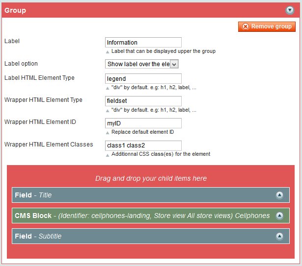
Label: Label of the group
Label option: Ability to add the label of the group before, after or inline of his value.
Label HTML Element type: Define the label html tag.
Wrapper HTML Element type: Define the wrapper of your field value html tag.
Wrapper HTML Element ID: Add an ID attribute on your wrapper tag.
Wrapper HTML Element Classes: Add css classes attribute on your wrapper tag.
Drop area: Drop your dragged items in this area.